No matter the industry, the sole purpose of landing pages is to drive conversions. According to research from the second edition of MarketingSherpa's Landing Page Handbook, forty-four percent of clicks for B2B companies are directed to the business' homepage, not a special landing page. Making this statistic even worse is the fact that of the B2B companies that are using landing pages, sixty-two percent have six or fewer total landing pages (only sixty-eight percent use more than 6). This reveals that some marketers are disconnected and not focused on the importance of landing pages and their proper utilization.
We have curated seven pieces of information, data, and/or statistics surrounding how to design effective landing pages for the purpose of driving conversions in the marketing industry. Additionally, we have presented ten additional examples (outside of the ones provided in the initial research) of effective landing pages that drive conversions. Effective has been defined as those that credible and reliable sources use as examples. For each one identified, we have provided a visual for it, and an explanation surrounding why it is effective for driving conversions.
Designing Effective Landing Pages: Driving Conversions
- Create an advantage-focused headline. This is essential as this is where the user journey begins. Their attention, interest and understanding must be an immediate thing. It needs to urge a consumer to stick around and find out what is being offered by the company. For a basic landing page, the bounce rate is reported to be between seventy and ninety percent. To keep that percentage lower, visitors need to know and comprehend what’s in it for them within seconds of arriving. The headline is the first thing a visitor will read, and it should transparently and precisely communicate the value of both the landing page and the offer. The number of words used should be kept below 20. An ideal amount is 10, but each word should count and should be there for a reason. One thing to keep in mind is that if the headline is also used with an image that explains the product or service, then it is not necessary to go into quite as much detail in the copy.
- Choose an image that illustrates the offer. Visual content is an extremely important part in making landing pages work. Images are the first thing a visitor processes and they have the potential to shape that visitor’s impression of the brand before they even read the copy. How important is this? Research reveals that when it comes to images versus text, the brain processes images 60,000 times quicker. This means that visitors will be affected by the images on a landing page immediately, so it is of paramount importance that the impression is a good one, and it should represent the target audience. To ensure that the visual content makes an impression, the pictures should be large and relevant to what is being sold, whether it be a product or service. For example, for a physical product, it is crucial that the landing page contains a clear and professional image of the product. Conversely, if it is a service being sold, the main purpose of the image should be to invoke a feeling by grabbing attention and demonstrating relevance to the visitor. The key takeaway here? The image should illustrate how the visitor will feel once they receive the offer.

- Prose is important, so write compelling copy. The landing page needs to make what is being offered crystal clear. A consumer that does not understand what the product or service is will bounce and they will be lost as a customer. Keep the explanation straightforward and to the point. Something to consider before writing copy is whether what is being offered is simple to understand. If so, the only things that might be necessary is a headline and a subheadline. However, regardless of whether what is being offered is simple or more complex, keep in mind that an explanation can either be integrated with a headline, or can be kept completely separate. Additionally, the benefits of the product or service should be top of mind. While the explanation itself can be functional, that part of it should be slanted towards the consumer. A way to think about this could be to consider the explanation of what is being sold as a goal that the landing page needs to reach and meet. While the copy can certainly be fun and unique, the top priority here should be clarity. Compelling copy also speaks directly to the consumer by using “you” and “your” to make them feel that this is a personalized experience.
- Adding a clear and standout call-to-action is arguably the single most important design element on a landing page if the point is to drive conversions (which is always is). At the end of the day, this is the exact part of the landing page design that the rest of the content on the page should be directing the visitors’ attention to. The Call to Action (CTA) should be large and impossible to miss. Bigger truly is better. As explained in the prior bullet point, make the copy compelling so the visitor is driven to use the CTA. It is suggested that the word "submit" not be used. Instead, use interesting verbs like "download now”, "start your free trial" or “send me info” that invoke something explosive, exciting, and persuasive. Make sure the CTA is in the form of a clickable button. The fact is that consumers expect the CTA to be in the form of a button. Don't confuse them! Assuming that the landing page has a color scheme, use a contrasting color for the CTA. Research shows that contrasting colors help to attract the eye and thereby perhaps compelling the click. Finally, don't lose sight of the importance of the position of the CTA button. Correct CTA positioning should not be an afterthought as it is an essential factor as to whether someone will click on it.


- Remove all navigation. As discussed in the introduction, the sole purpose of landing pages is to drive conversions. Any competing links, including internal links to other pages on the website, will distract from that goal. If a company starts requiring their visitors to click off the page to get to the explanation, value proposition, or the benefits of the product or service, they are more likely to bounce. The best landing page designs keep all of their elements on one page so navigation is not even necessary, and in fact, those elements should follow a logical flow to keep visitors moving toward the CTA so that navigation is not required. To do this well, start with an explanation, continue with the benefits, always include social proof (testimonials), and end with the CTA. The structure for this does not have to be subtle, so a designer should feel free to allow a landing page to have marked off sections. In fact, if the logical flow is augmented with corresponding design flow features, this will improve the process with visual and cognitive coherence. If the landing page is on the longer side, then this is particularly important. One last piece of research, if you are not yet convinced about the removal of a navigation bar: It’s been shown that removing the navigation menu on your landing page can increase your conversions by 100%. That's a great incentive.
- Show People Social Proof. It is important to provide the number of likes, shares, subscribers, pins, and tweet the company/brand/product/service has. These should be displayed prominently on a landing page. Research shows that social proof is effective for persuading people to take a desired action. When it comes to the Millennial cohort, over fifty percent of this generation are more likely to purchase something if it has been recommended online, according to Bazaarvoice research. Social media and recommendations from trusted peers should never be underestimated in the role it plays in purchasing decisions. Social proof can also take the form of reviews and testimonials. If this route is chosen, it is best practice to use testimonials from real people. While influencers, celebrities and experts are great, testimonials from real customers are much more authentic and are more relatable to consumers. Pictures are as the basis of trust in testimonials, so ensure that every featured testimonial is accompanied by a photo of a real person. Testimonials should be specific. The best testimonies are those that are backed by credible and reliable numbers, data, and specific applications. By including social proof on your landing page, you're validating your offer without even saying anything.
- A/B Test the Landing Page. Even if the design tips presented here are implemented, it is still supremely important to ensure that the landing page is actually seeing the number of conversions that is expected. If not, the company must determine where people are getting lost. This is achieved by doing A/B (also referred to as Split) testing. Marketers should look at the landing page’s performance by looking at heat maps, scrollmaps, and user recording sessions to see if there’s any room for improvement. Once that has been determined, test different design versions of the landing page against each other to see which one performs better. By A/B testing and further refining landing pages over time, traffic optimization can be achieved, as well as making sure that advertising dollars are well spent. The most important aspect to split testing is to make very small adjustments with each experiment. For instance, do not split test the headline and the image at the same time because it will be difficult to figure out which element garnered the results. For this reason, stick to testing one element at a time. The “winner” becomes the champion, then a new challenger can be created to test the next element. This cycle can be repeated until a conversion rate is reached that is acceptable. While anything can be tested it is suggested that testing be limited to a few of the most impactful elements of the page which includes what was discussed in this brief: headline copy, image, the color of the CTA button, click triggers, copy on the page, and lead form length and fields. These tests will have the biggest impact on conversion rates.
Examples of Effective Landing Pages That Drive Conversion
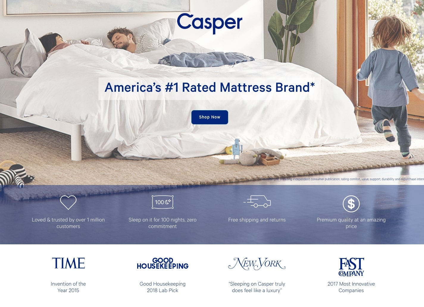
Casper
- Casper's landing page is effective for driving conversions for many reasons. The headline Casper uses: "America's #1 Rated Mattress Brand"., speaks clearly to the consumer as to why they should buy a Casper mattress.
- The image used has a very cozy family feel which is what this brand aims for, and the social proof by influential brands such as Time and Good Housekeeping provide testimonials for the offer.
- The copy is done as bite sized points with images (truck that is moving fast for shipping and returns) which make it easy to read and lists the reasons why Casper is the smart choice for the consumer. (Loved and trusted by over 1 million customers accompanied by a heart image is another example).
- The 100-night zero commitment statement adds credibility to the page, and the pricing information helps the visitor figure out whether they should click the CTA button.
- The color used for the “Shop Now” CTA button contrasts with the background image and informs the consumer what to expect when they click it.
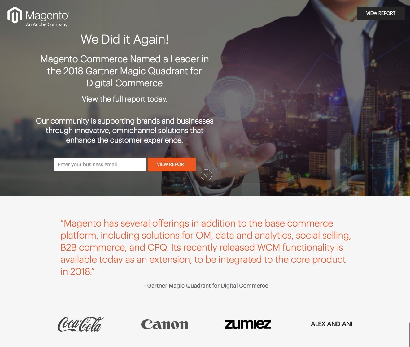
Magento
- This landing page for Magento works well on many levels. Keeping in mind that most people are reluctant to provide too much personal information, this landing page likely ends up generating a lot of conversions. The 1-field lead capture form is appropriate for a free report ("enter your business email"), and the CTA button copy ("view report") is relevant to the offer and the button color contrasts with the page.
- Social proof in the form of customer images from Coca-Cola and Canon add gravitas to the page.
- The Gartner quote is brilliant and gives the visitor a taste of what the report will provide.
- Attractive iconography coupled with relevant and to the point supporting copy explains what the Magento platform does.
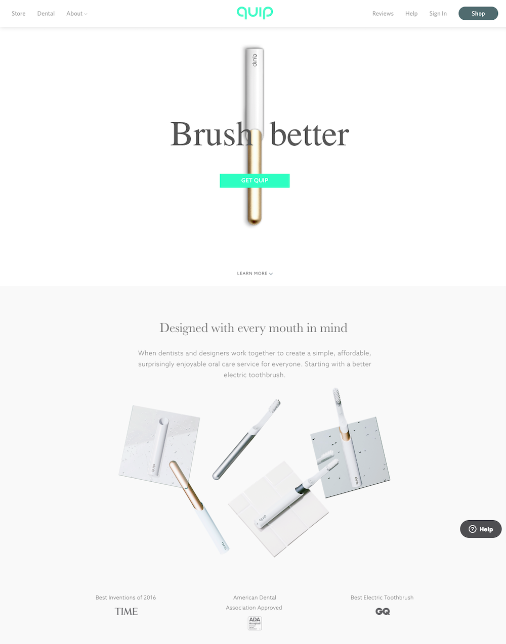
Quip
- Quip's headline on the landing page is crystal clear and to the point because it reveals the company's unique value proposition (UVP).
- The “Get Quip” CTA button copy not only explodes on the screen because of the color of the button contrasted with the white of the background, it gets right to the point and lets people know that they will ‘Get Quip’ once they click it.
- The visitor is assured immediately by the image of the different sized brushes that Quip has a brush that’s going to be personalized to their mouth.
- Adding credibility and social proof, Quip placed brand reviews by impressive companies like GQ, Time, and the American Dental Association on the landing page.
- The "learn more" invitation is cleverly placed above the different sizes of brushes which invites the visitor to do just that.
- The help button is discrete and to the side, but still noticeable with an attractive and serious looking gray tone.
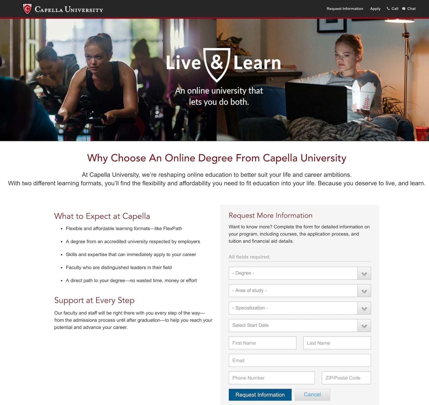
Capella University
- Capella University's headline will hit home with people looking to obtain a degree since it effectively communicates a problem that most college students experience. (..."to better suit your life and career ambitions.") and ("...find flexibility and affordability...") In addition, the form headline and the CTA button copy communicate the same message which provides cohesiveness, as well as driving that point home.
- The background image completely speaks to the message in the headline (one person being shown in a spin class and then also studying using her laptop).
- The brief, to the point, and relevant bullet points make an effective case why the visitor should enroll in Capella University.
- The accreditation section convinces the person that opens this landing page that the university is a recognized facility for higher education.
Nomadik
- Nomadik is clearly focused on keeping their landing page focused on their goal. A landing page should not offer numerous products or services as it waters down the message.
- To stop people from bouncing from their landing page, Nomadik provides only relevant information concerning the product and subscription service. This landing page points to the different subscription options for its monthly outdoor box.
- Nomadik shows prices for each subscription length and includes CTA buttons that have a specific message (continue) with beautifully contrasted colors to get people to the right place.
- The company makes it clear that the consumer can skip any box, and their "ironclad" guarantee provides peace of mind.

Garage Grown Gear
- Garage Grown Gear (GGG) uses intriguing graphics to highlight the nature of their landing page, which will capture the imagination of anyone that lands here.
- By including an image of a hiker on a mountain the aim is to inspire their audience to enter a giveaway. Images are a great way to capture feelings and to inspire action.
- An email signup form is easily visible, without distracting from the imagery, to encourage email signups, and just above it a testimonials button invites the user to look at the social proof.

Rover
- This Rover landing page is an excellent example of how limiting the amount of information on the page can turn into conversions.
- Obviously a company will want to provide enough information to tempt their visitors, but the less information added to the landing page, the more likely a brand will see curiosity turn into conversions.
- Extra text, images, and links can send visitors to the wrong place. Rover sends consumers to a unique landing page for their grooming services. Certainly the page does have some very basic navigation, but it largely consists of simple images that tell an effective story, a couple of lines of text, and a bold green CTA that drives conversions.
- If the consumer wants to know how it all works, there is a separate section just below the CTA that provides more information.

Pizza Hut
- When creating a dedicated landing page and domain for its fundraising efforts. Pizza Hut still hosted the landing page on their website. This is an incredibly effective way to increase a website’s Google rankings., though it won't be suitable for every company, product, or service.
- Containing not one bit of information about their products, this page has no navigation or links. It’s a simple page with limited information which encourages the use of the bright red, can't be missed, CTA.

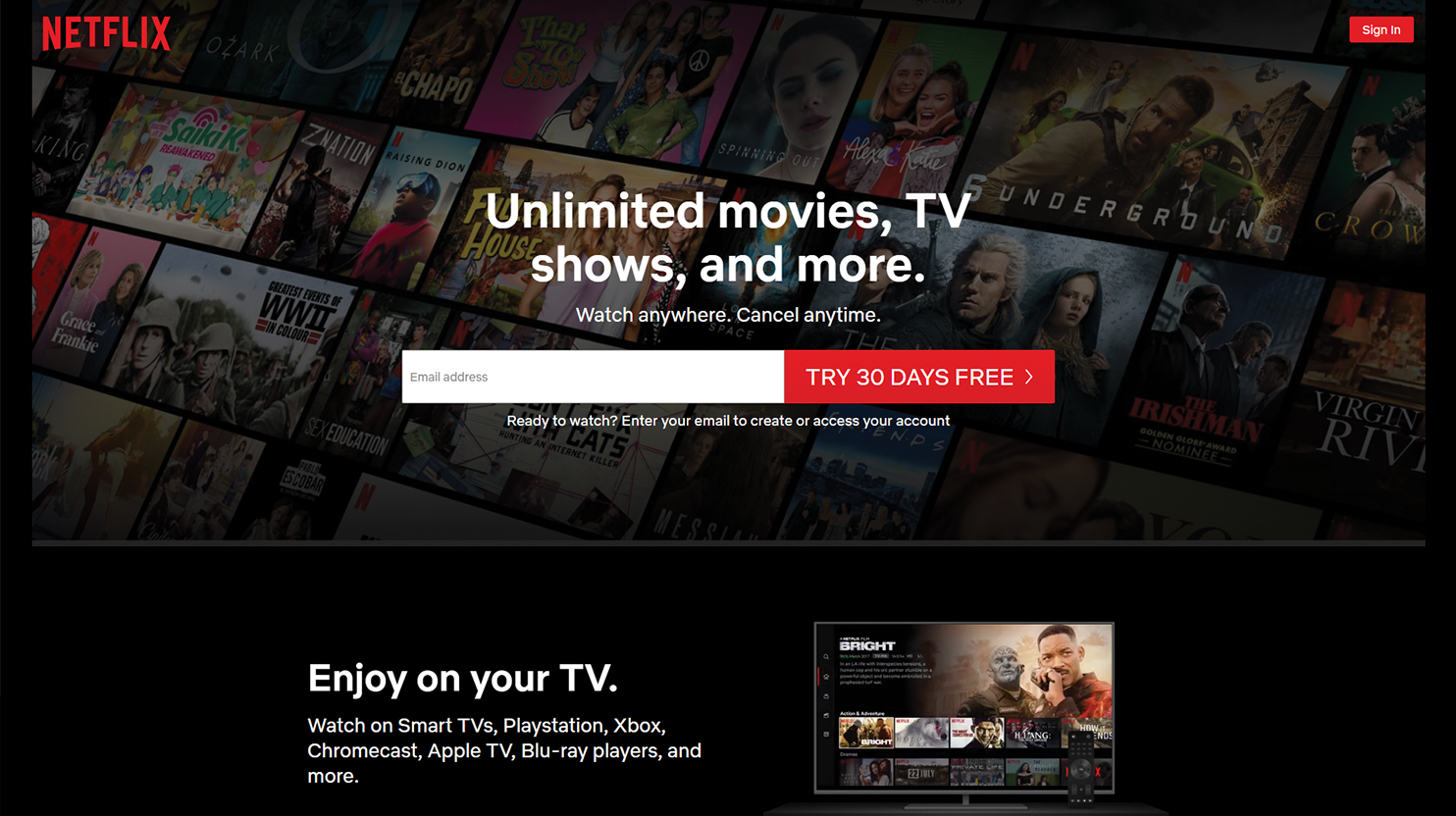
Netflix
- This landing page for Netflix ticks all the boxes of a classically perfect landing page insomuch as it has a clear call-to-action and a minimalist sleek design overall.
- The form visitors have to fill out is as short as it can be, and initially, Netflix only asks for an email. That’s something to learn from: subdivide a large form into a few smaller form pages and never ask for information that is not necessary.
- Text is minimal and serves a very precise function of answering every possible objection a consumer might have to giving Netflix a try. “Watch anywhere. Cancel anytime.” answers all concerns in two short sentences: “Yes, you can watch on all devices, meaning everywhere.” and “Yes, there is no tangible financial risk.”
- The fact that the message is so clear and short means that anyone can quickly understand what the next step is. The simplicity of the form makes it easier for the visitor to take said step. This is likely to drive conversions.
- All other text is aimed at responding to possible concerns and objections to taking the next step.
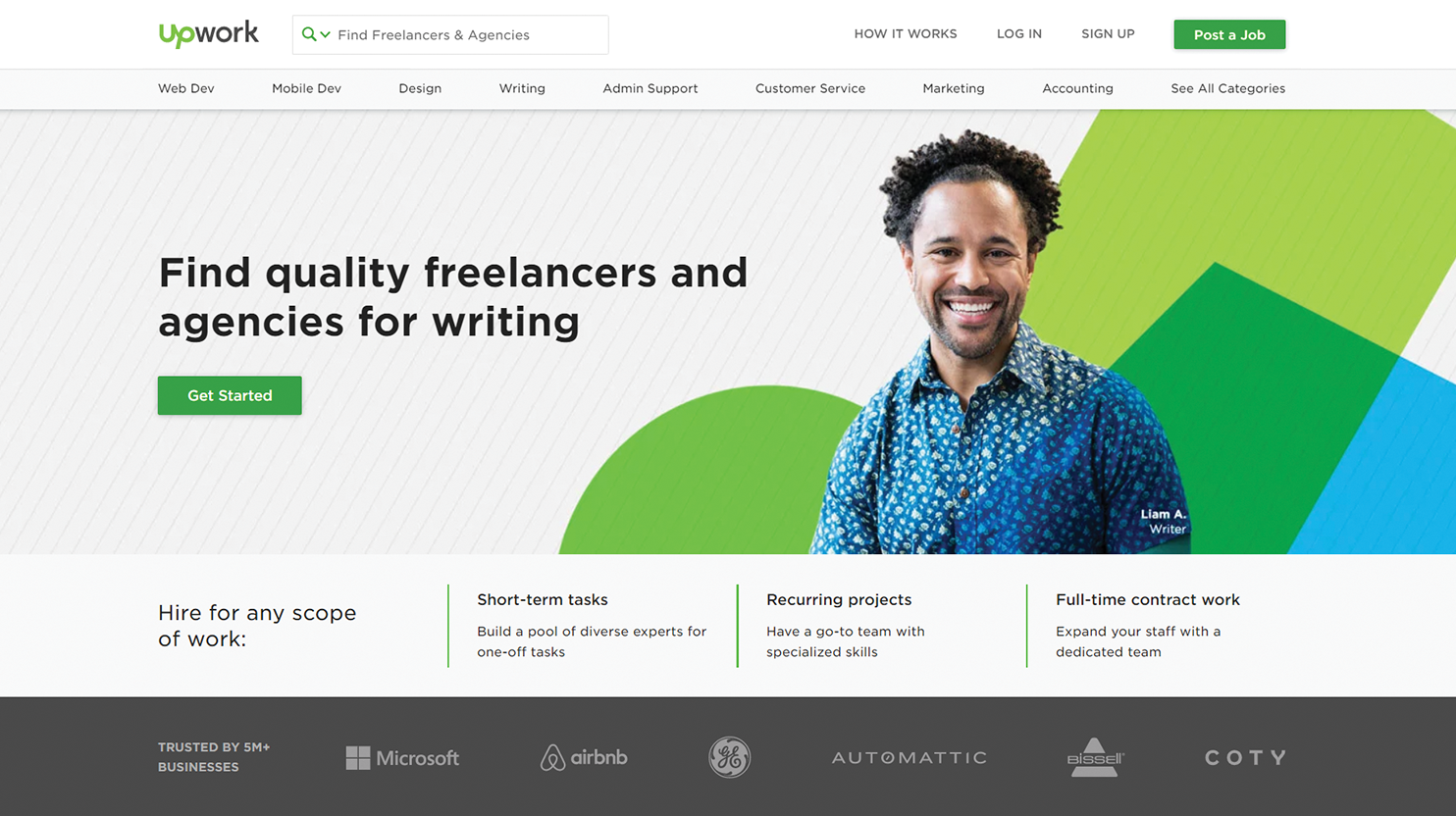
Upwork
- This landing page for Upwork focuses on structure which includes the company's value proposition, the “Get Started” CTA that pops out, and the photo of an actual Upwork writer Liam A.
- For social proof, there is a list of businesses that use Upwork. Right below that there is a list of experienced writers and editors on Upwork with what they charge, so the visitor knows there’s someone for whatever task is needed and at whatever price point.
- The landing page provides four-step instructions on how to proceed with hiring from Upwork and have to fill out a very basic three-field form to “Get Started.”
- The landing page is focused on Upwork's target market, people looking to hire freelance writers online. Typically, this target group has three areas of concern: that the writer will charge too much, won’t deliver work for a deadline, or that the work will be of shoddy quality. Upwork addresses all these possible issues by presenting a selection of people who have a number of positive reviews which solves the problems of the quality of their writing, their time-management skills, and what they charge.
- Upwork’s landing page establishes authority, showcases real and friendly people working there, and presents the visitor with an extremely simple form.